
Colours have powerful effect on our every day life. They affect our feelings. When you consider that feelings trigger our thoughts and our thoughts affect the actions we take, it seems logical that the colours we surround ourselves with in our homes can set the tone for the way we spend our days.
Basic colour theory
There are three primary colours – yellow, blue and green. These are colours that have no other colour in them but they can be used to make other colours. Blue has no yellow or red, yellow has no blue or red and red has no blue or yellow.
There are three secondary colours. Green is a mix of yellow and blue. Purple is a mix of blue and red. Orange is a mix of red and yellow
There are six tertiary colours. Yellow green, blue green, blue purple, red purple, red orange and yellow orange.
Any of these colours can be altered by being lightened or darkened or by varying the amount of colour that is used to mix them.
Finally there’s black and white. Most artists use black on it’s own as a contrast to another colour. Sometimes it is used to darken colours. White can be used on it’s own and is also often used to create soft pastel neutrals that are so popular right now.
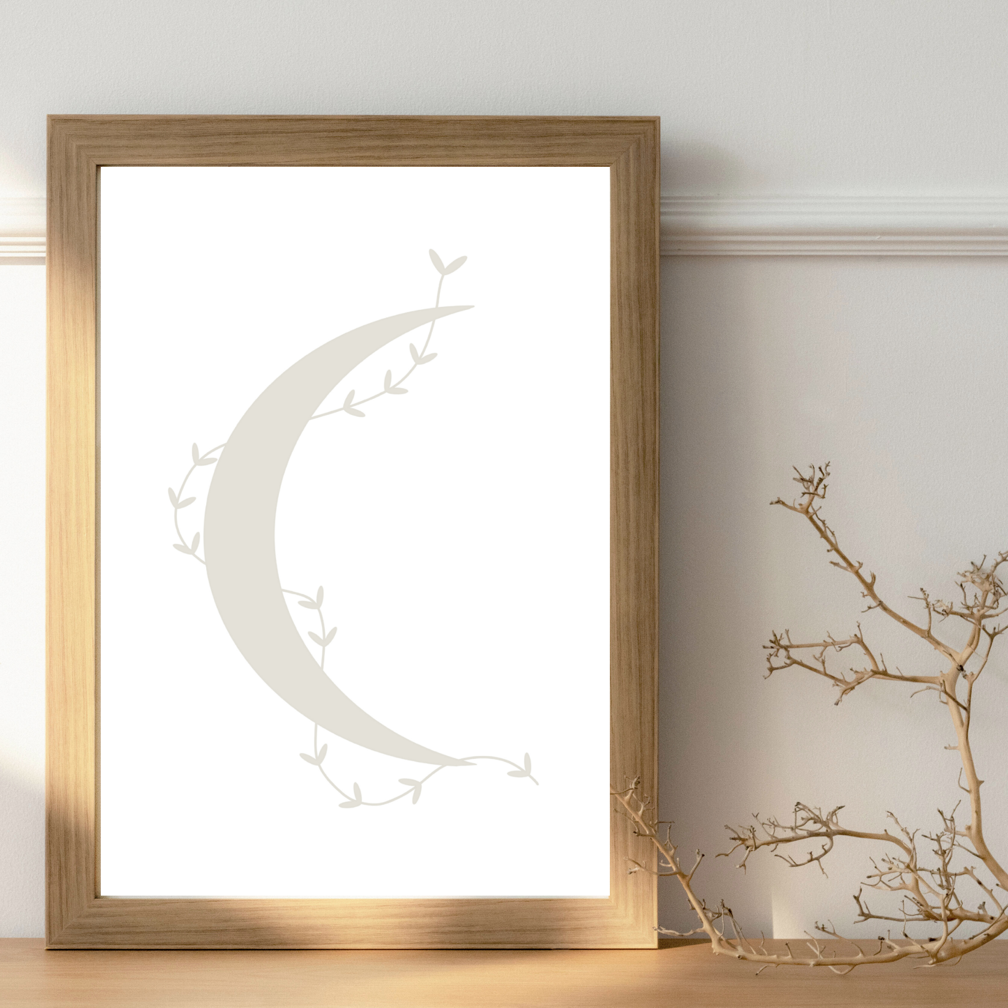
Pastel neutrals
I’m working with pastel neutral colours at the moment. I find them so gentle and calming to work with. I can imagine the finished wall art in a modern rustic barn conversion or a contemporary new home.
Pale colours are often associated with Scandinavian style. White walls paired with other soft muted colours can create a very fresh, calming space and make us feel relaxed. This can be great at the end of a busy day.
Inspiration for this style can be found in landscapes bleached out by the hot summer sun, washed up shells on the beach, fading dry flowers and naturally weathered wood.
When choosing a pastel décor layer up cool or warm colours and add lots of different textures such as natural wood, dried flowers, antique linens, plates or cutlery. If you feel your room needs a little more contrast, greenery seems to go well with any scheme.
Cool pastel hues
Cool pale colours include faded blues, washed out greys and pastel pink. When adding metals to this type of scheme go for an antique silver look.


Warm pastel hues
Pale warm colours include a yellowy cream, pale peach or a warm beige. When adding metals to your warm pastel scheme try old gold.


Other colour schemes include dark and dramatic, warm and cosy, monochrome or bright contrasting colours.
Dark and dramatic
Dark colours create impact and drama but they can also make a space feel very cosy.
Warm and cosy
The reds, oranges and yellows of Autumn can create a feeling of cosiness.
Monochrome
Using a single colour or different shades of the same colour in your wall art creates a cohesive and harmonious look, adding a sense of unity to your space. Shades of blue or green can create a calming, back to nature feel. Shades of red can evoke drama and intensity.
Contrast
To create high contrast choose colours on the opposite side of the colour spectrum. Pair blue with orange or red with green. Dramatic contrast and primary colours were used to create modern geometric art in the early mid century and is still popular today.
Using inexpensive wall art to experiment with colours is a great way to avoid making mistakes that are too costly.
For more ideas visit the One Purl Row Wall Art Etsy store.


